Down the Summer & Winter Polychrome Rabbit Hole
I set out to explore color in Polychrome Summer & Winter. Instead, I stumbled upon a structural conundrum that none of my weaving books explained.
I got a wonderful present from my son who was visiting from New York City. It was Sanzo Wada's book called "A Dictionary of Color Combinations".
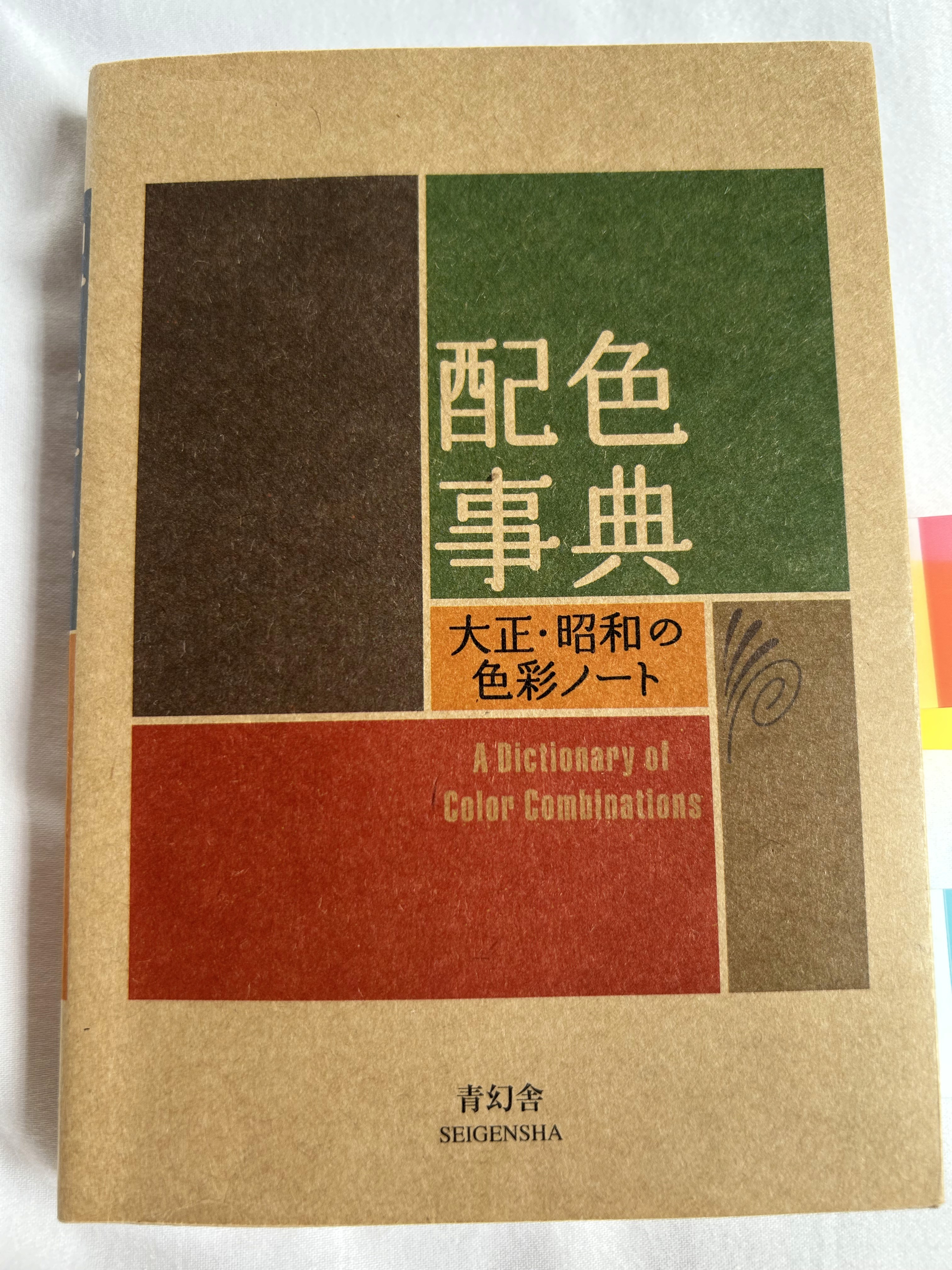
A Dictionary of Color Combinations by Sanzo Wada
It it a lovely little book derived from the original 6-volume set compiled between 1933 and 1934. I immediately wanted to weave something using the color combinations in the book. My first thought was double weave because it would isolate the colors and let me see them in juxtaposition. But I wanted to weave towels or napkins—not only because I always gravitate toward useful textiles, but also because I have the widest range of colors in 8/2 cotton and cottolin in my stash.
I started thinking about Polychrome Summer and Winter. I had woven it once before as a sample for a Meta Weave class. Polychrome offers the same advantages of traditional S&W in terms being a shaft-thrifty block weave, but it has the added advantage of being able to juxtapose areas of two or more different colors both vertically and horizontally. For example, in Summer & Winter I could weave treadling block A with a red pattern weft and follow it with an orange pattern weft in treadling block B (where these colors appear as "pattern" is determined by the tie up and where they don't appear which is called "background" is warp dominant, but in Polychrome, I can weave both red and orange in treadling block A and have red appear in some blocks and orange appear in others in the same treadling block. I can also get "background" if I want it. See below.
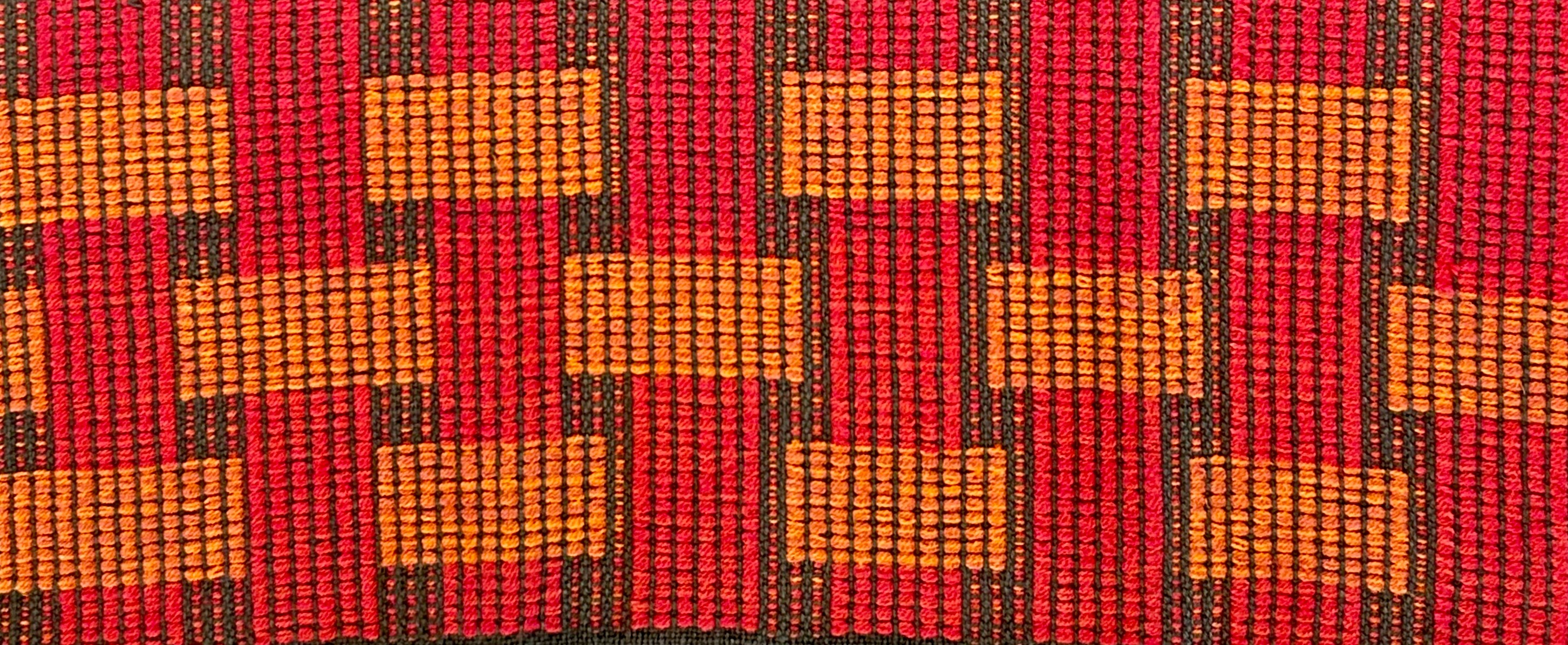
Close up of Summer & Winter Polychrome border with 2 different threading variations
I wove it as a border for a towel in 16/2 cotton (warp and tabby) with 8/2 as pattern.
It worked well as the border because it is dense and not that drape-y. It is also a slow, 3-shuttle (min) weave. Being a glutton for punishment, I decided to see if I could make a series of napkins with over-all patterning and using many different color combinations from the book. I developed a graphic motif from a modern Finnish design I had seen online.
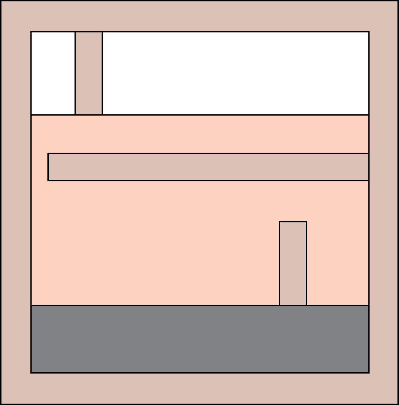
I marked the blocks and created a draft.
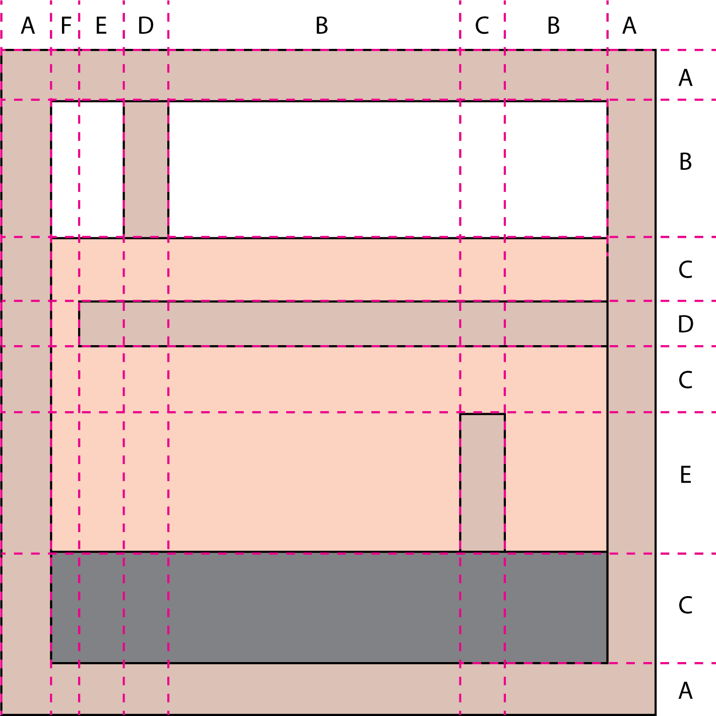
I used a standard Summer & Winter threading because, at the time, I thought I fully understood how Polychrome worked, but I knew that the trick with polychrome is to make the pair of pattern picks usually deployed in S&W behave a little differently.
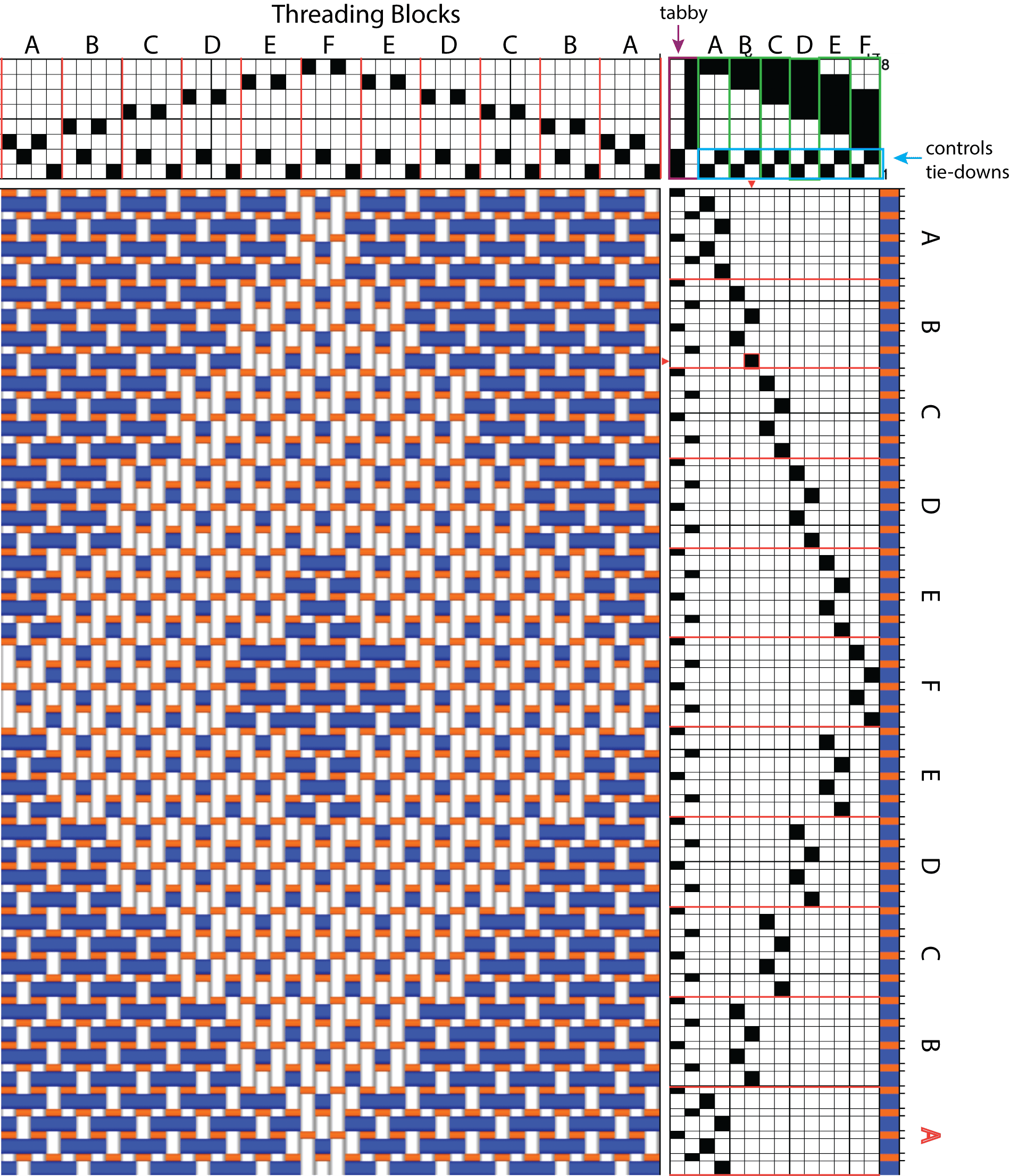
Drawdown of standard Summer & Winter design with tabby in orange and using the alternating treadling
In standard Summer & Winter, the two pattern picks are usually the same color and alternate between tie-down shafts 1 and 2, and are tied up to appear as "pattern" (weft floats appearing on the surface of the cloth) in some threading blocks and "background" (weft floats appear on the back of the fabric) in other threading blocks.
But from what I understood about Polychrome, the patten picks can be tied up on opposites - if you want pattern pick 1 to appear on the surface in some threading blocks and pattern pick 2 to appear on the surface in the opposite blocks – thereby achieving the polychrome effect of getting multiple colors to appear across the warp "at the same time" ish.
You can see in the polychrome version there are two colors used as pattern and the tabby is in the following order: tabby A, pattern color 1, pattern color 2, tabby B, pattern color 1, pattern color 2, etc. In standard S&W pattern picks alternate with tabby picks: tabby A, pattern, tabby B, pattern, etc.
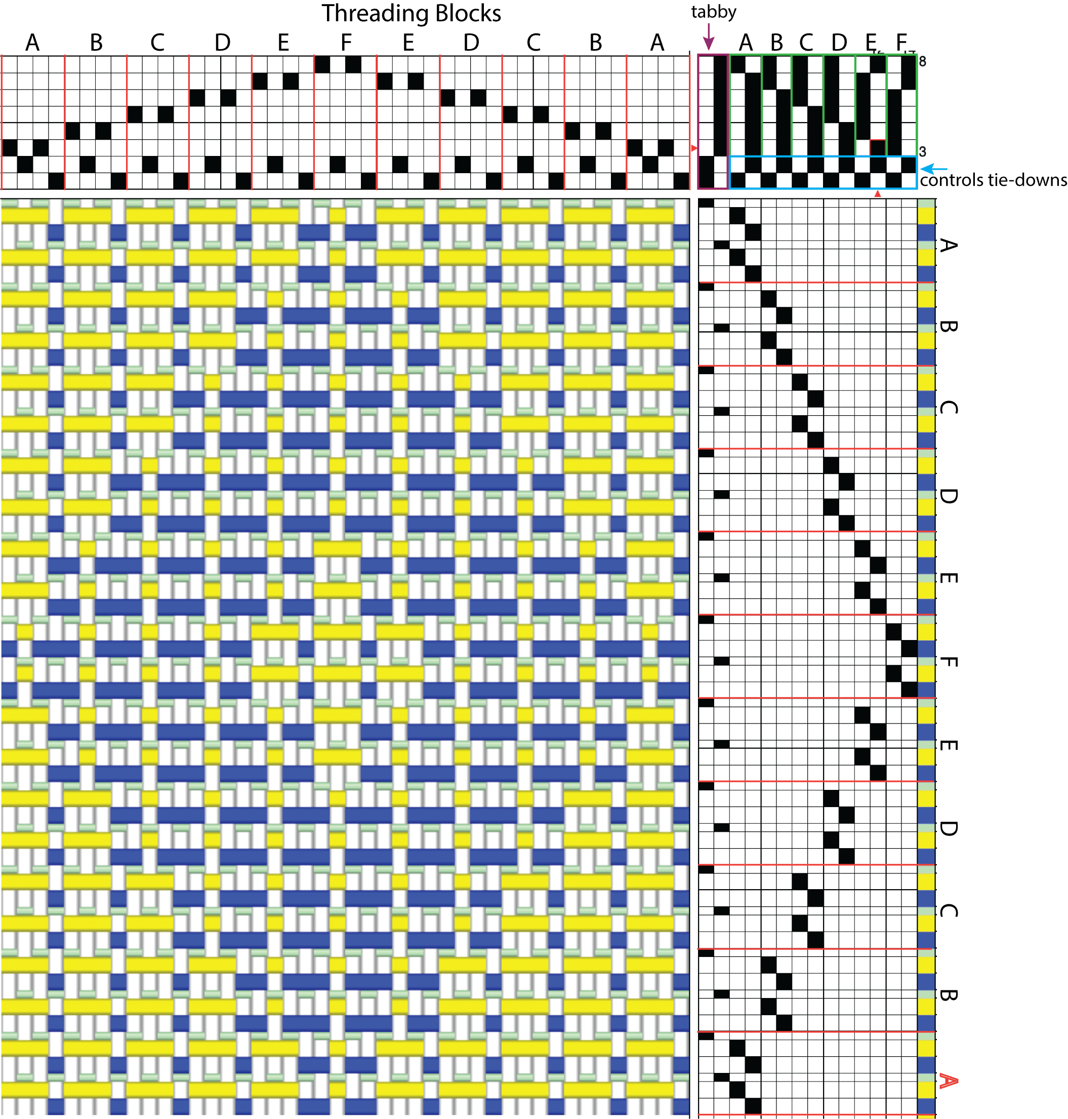
Drawdown of Summer and Winter Polychrome using my first tie-up
This was my understanding of how Polychrome worked, but I did do a little research. I discovered that different books arranged the tie-downs differently—and none of them explained why. While I found scads of info on S&W variations, Polychrome info seemed sparse. And a lot of what there was focused on Taqueté or other "no tabby" variations that are used for heavy rugs and wall hangings. I really wanted to figure out how to deploy this neat trick for a napkin or towel. So I jumped in as I usually do by winding an 8-yard warp:))
I figured that a fine warp, relatively loosely sett, would be a good starting point for attempting to get a lighter-weight result. I had some white 20/2 cotton from Lunatic Fringe on my shelf, so that is what I used. It is about 8,400 ypp so I decided to sett it at 30 epi. I drafted it like this (I changed the tabby in the drawdown to mint green so you could see it better), and it looked pretty good theoretically.
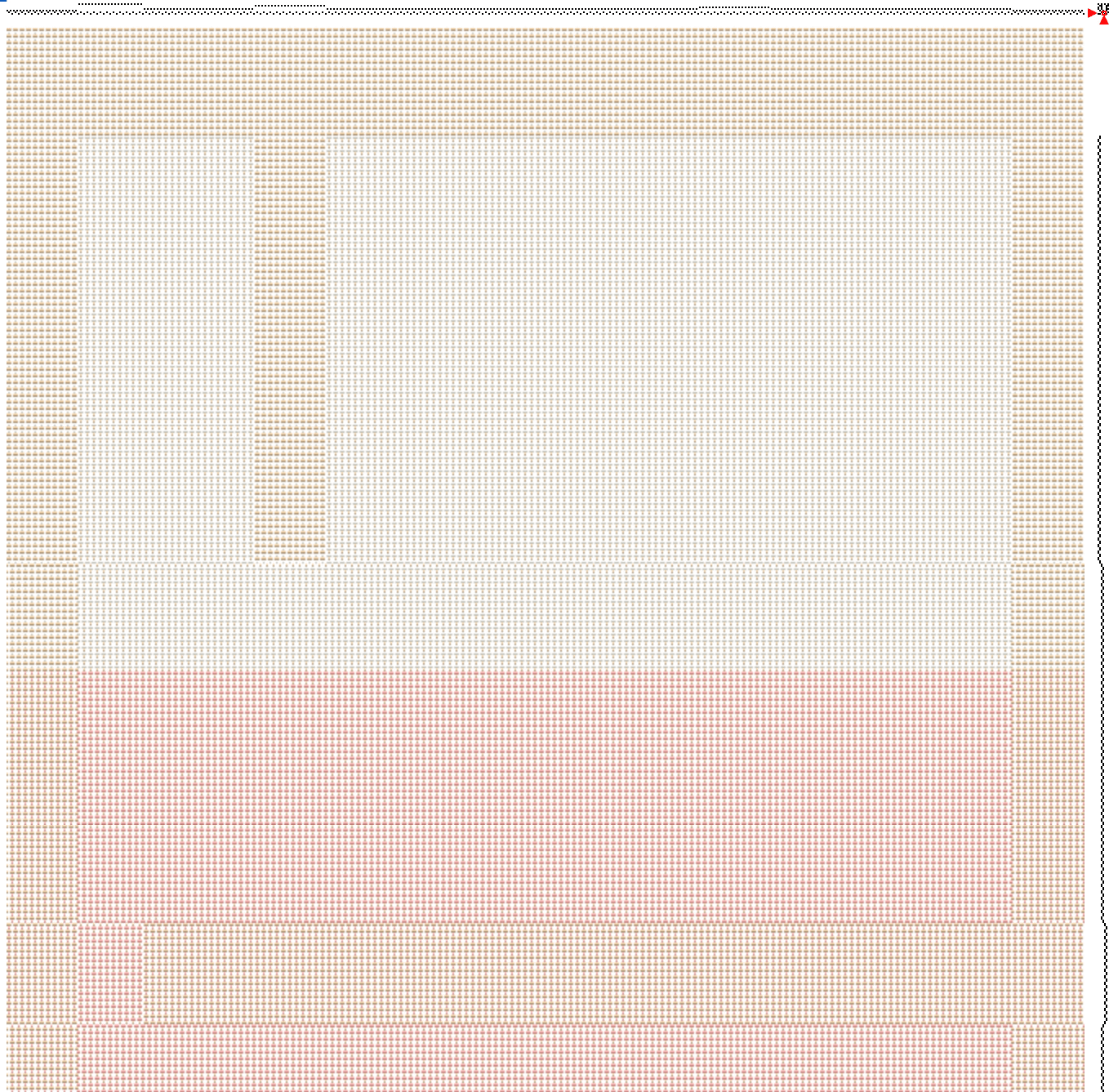
Partial drawdown of my graphic woven using the tie-up in the close-up below
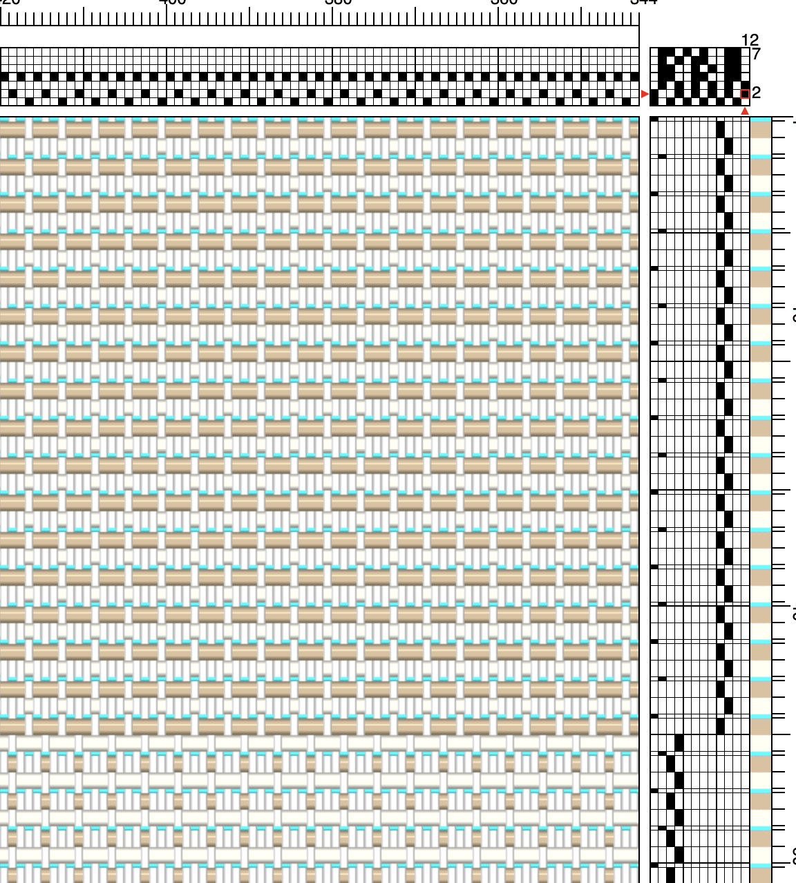
Close-up of my first napkin drawdown using my "assumption" tie-up
But there were some surprises when I wove it. The beat wasn't even close to the expected 60 ppi, and I had to use a ribbon template to place my color and block changes correctly because my predicted pick count was way off. I was getting about 45 ppi. I cut the first napkin off, and washed it. The colors were more muted than I expected, and there was some strange weft shifting in the solid areas around block changes. The hand, however, was actually quite nice for a napkin.
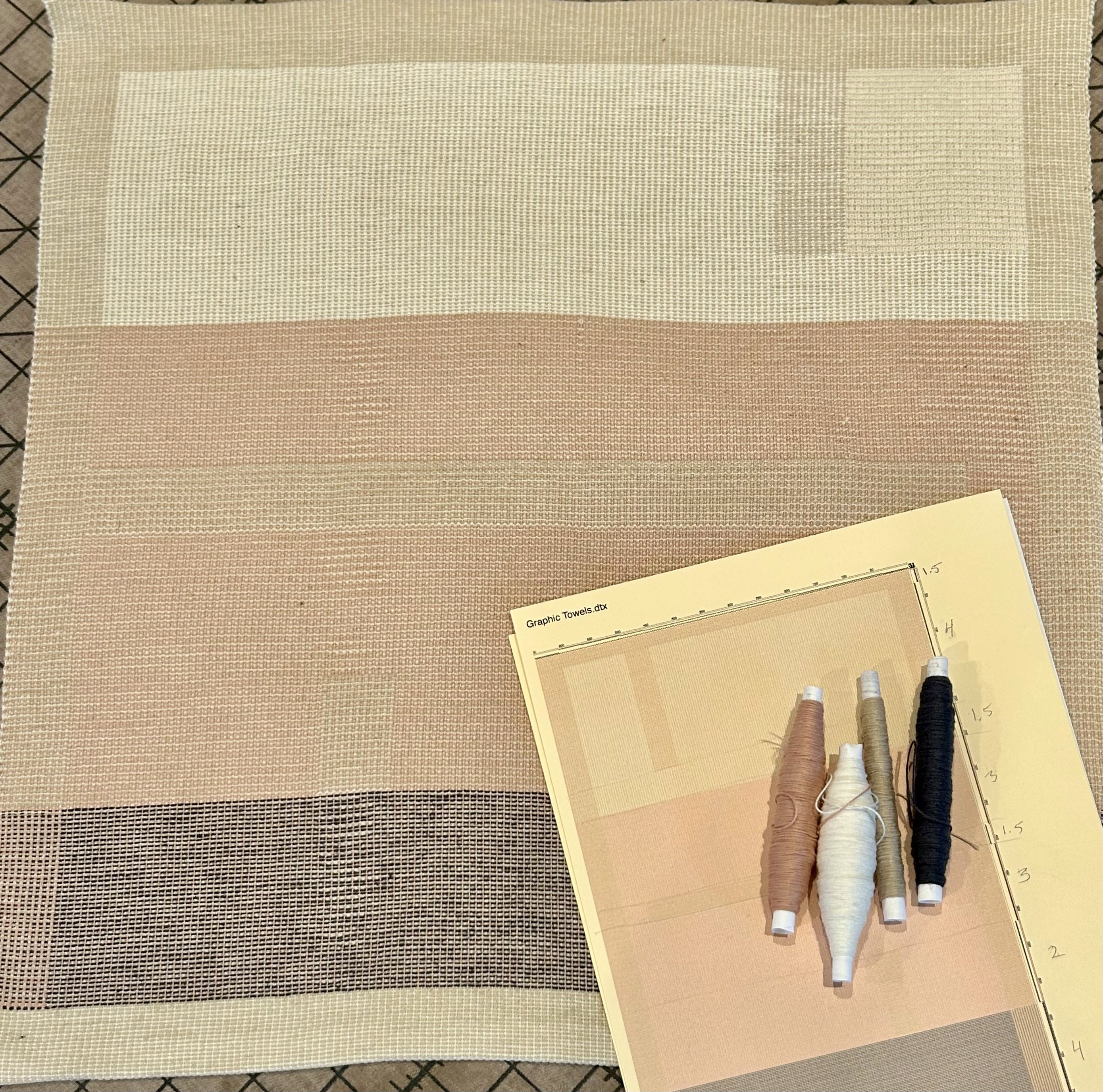
First napkin off the loom and washed. The strange weft shifts and muted colors made me think . . .
I think I know what the beat problem is, and I think I know how to fix it, but I am worried that making the correction that will fix the beat and get the colors to pop will also result in a denser and less napkin-y napkin. I went back to the books to see if there were any explanations and I saw that my tie-downs were tied up in the common alternating sequence (see tie-up on previous page). But in many of the drafts in the books they are tied up like this: with each pattern treadle pair using the same tie-down and then alternating with the next pair, i.e. tie-down shaft 1 for treadles 3,4; tie-down shaft 2 for treadles 5,6 and so on.
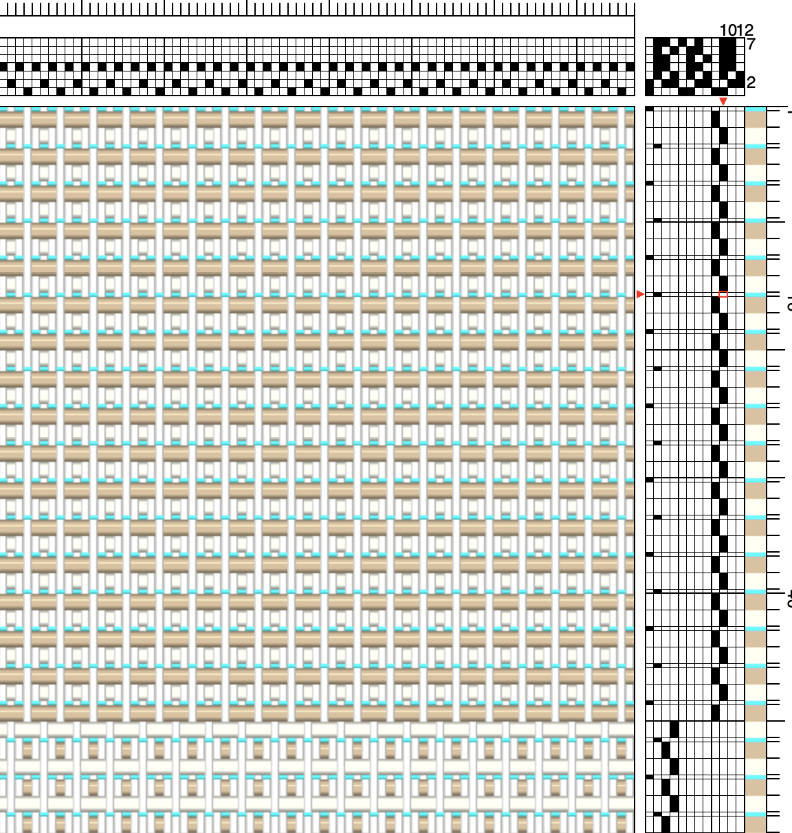
The corrected tie-up. I am concerned about how the tie-down shifts will look at block changes and how the tie-downs for block A and block E won't change
I had missed this!!
I also looked back at my Meta Weave towel draft in Polychrome and saw that I had my tie-downs arranged in Dukagang order and even had drafts for the other styles of polychrome tie-downs using the same idea of keeping tie-downs the same for each pick pair. Why that knowledge eluded me here is a mystery.
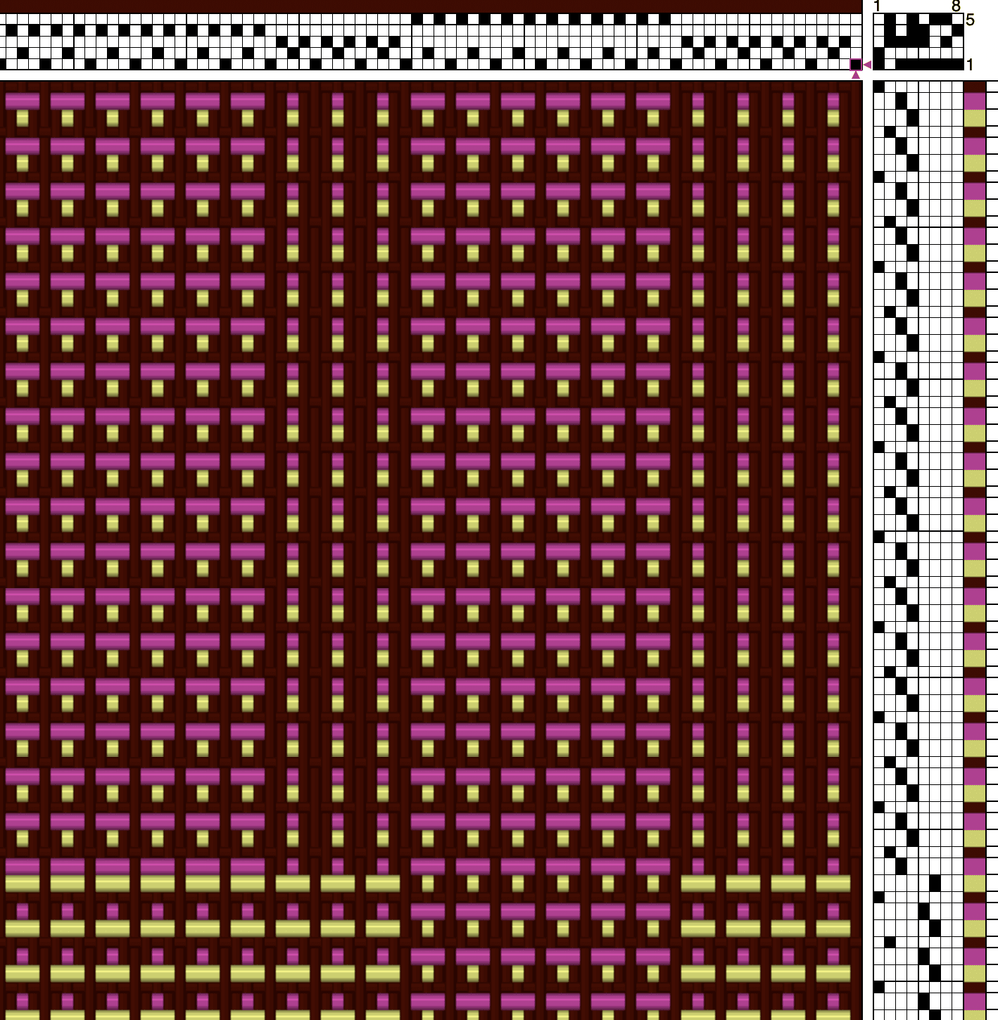
Summer and Winter Polychrome for Meta towel using Dukagang style for the tie-downs
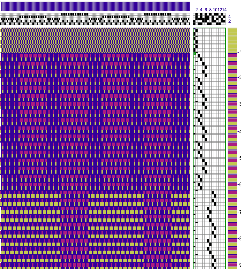
Both of these arrangements will have longer warp floats, and if I am correct in my hypothesis, may allow the pattern weft picks to move together as more of a unit for more vibrant color, closer to expected ppi and probably a denser cloth. I also noticed that in my Meta Weave draft I didn't arrange the tie-ups as opposites. And I remember why now. For that design, I needed to have some background areas (areas where neither of the colors were on the surface) to create the spaces between the graphic "threads". So as you can see in the drawdown, Threading block A has neither the pink nor the green pattern weft on the surface. The down side of this arrangement is that the back isn't simply a reverse of the front the way it is in the "opposites" arrangement, but something else entirely.
I have re-tied my loom, and I will weave the next napkin in the revised tie-down arrangement. Whether my hypothesis survives contact with the loom remains to be seen. I'll report what I find in the next installment: Summer & Winter Polychrome Rabbit Hole—Continued.
Lisa
Banner picture: Second tie-up test on the loom
Comments